
It’s that time of the week again, friends! We’re back with another Top Ten Tuesday, a weekly meme hosted by That Artsy Reader Girl. This week’s prompt is: cover redesigns I’ve loved/hated. Okay, I admittedly struggled with this one because I realized that I’m actually not very aware of what book covers have been redesigned. Are different editions of books considered cover re-designs? Like, international vs US vs UK editions? I’m still not very clear on it but I’ve made a list of some covers that I’ve loved and hated. I think most of the time when a cover changes I’m pretty okay with it, although sometimes, I’m disappointed that the original covers get pulled and we mere mortals won’t ever have the chance to get our hands on it without kissing our monies goodbye! *drama*
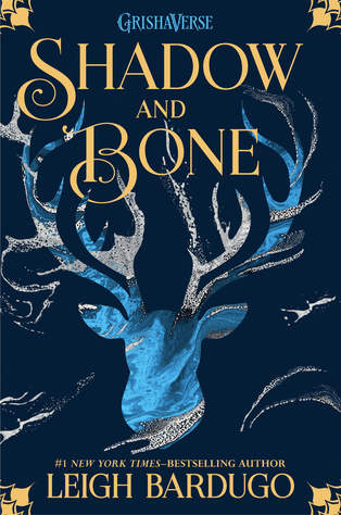

Shadow and Bone (The Shadow and Bone Trilogy #1) by Leigh Bardugo
I know that a lot of people have commented that they like the original cover so much more, but I actually really like the redesigned cover more. I think this is mostly because of the colors!


Throne of Glass (Throne of Glass #1) by Sarah J. Maas
I like the cover redesign so much better than the original cover. It’s just honestly so much more bad ass and fitting of the fierce killer character that Celaena is introduced as!


Northern Lights (His Dark Materials #1) by Philip Pullman
This one also has a different name: The Golden Compass but I prefer The Northern Lights name and cover much more. There are so many versions of both titles but I think these are my two favorites!

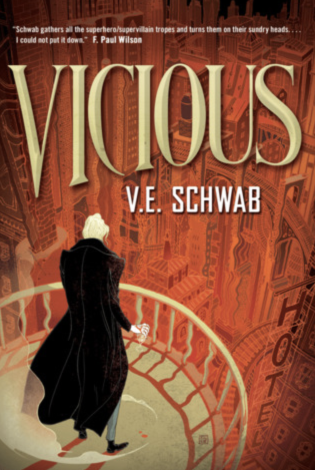
Vicious (Villains #1) by V.E. Schwab
One of my biggest book related regrets is not buying that original/first edition cover of Vicious before the series became popular. I don’t know why I didn’t do it, but I was a silly duck. I do love the editions that I have now, but the details in the first edition are awesome and if I were to buy one now, I’d have to sell an arm, leg and liver for it (probz, you know) 😅

★★★★☆ 
Five Feet Apart by Rachael Lippincott
This probably doesn’t count but I’m making it count because I’ve only been able to find the movie cover locally and I don’t know why they’d ever change it. That first cover is gorgeous!
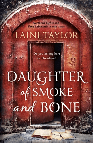
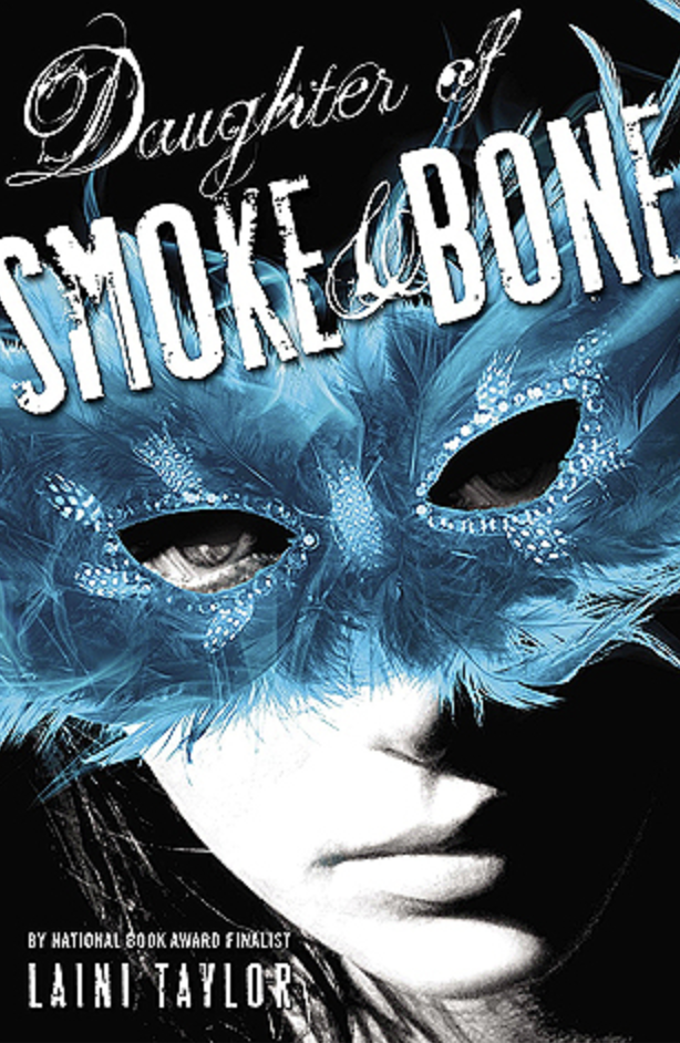
Daughter of Smoke and Bone (Daughter of Smoke and Bone #1) by Laini Taylor
I don’t know what to say about that cover with the mask except I really hate it. I also hate that it was actually the redesign? Or is it just the the US edition? Whichever it is, I’m really not here for it lol


The Girl He Used to Know by Tracey Garvis Graves
While I don’t dislike the cover with all the hearts on it, the colors are beautiful and stand out, but I like the simple cover with the girl on the front so much more.

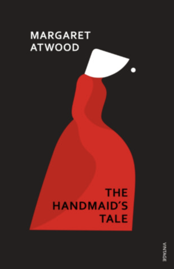
The Handmaid’s Tale (The Handmaid’s Tale #1) by Margaret Atwood
I actually do love the original cover, but I don’t hate the cover of the modern vintage edition.


An Ember in the Ashes (An Ember in the Ashes #1) by Sabaa Tahir
I actually don’t mind both covers although I do love the redesign because I love seeing the characters’ on the front and I love seeing how they change through the rest of the book covers!
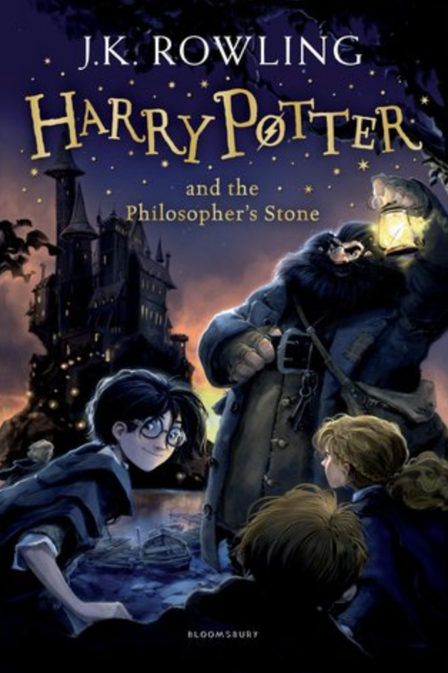

Harry Potter and the Sorcerer’s Stone (Harry Potter #1) by J.K. Rowling
Obviously depending on where you’re from and what edition you’re reading, it’s also The Philosopher’s Stone! The HP books have gone through so many cover redesigns/editions but the ones I will always love most are the first (US) ones. It takes me back to my childhood and I’m not so much a fan of the newer editions (sorry not sorry)!

Do you like cover redesigns or different cover editions? Are any of the ones you’ve liked/hated on this list too? If you’ve also done a TTT for today, don’t forget to leave your links in the comment and let’s chat 🙂
